
The Power of Colour in Property Presentation
How Colour Tones Affect the Sale and Price of Your Home
When it comes to selling your home, most sellers focus on big-ticket items—kitchen updates, curb appeal, or staging furniture. But there’s another factor that plays a massive role in how your property is perceived: colour.
The colours you choose for walls, finishes, and furnishings can make or break a first impression. From creating a welcoming atmosphere to helping buyers visualise their life in the space, the right colour tones can directly influence how quickly your home sells—and how much a buyer is willing to pay.
In this blog, we explore how colour tones affect buyer psychology, which palettes perform best, and how to use colour strategically to boost your sale price.
Why Colour Matters in Real Estate
Colour is more than just decoration. It creates mood, defines space, and evokes emotional responses. Buyers aren’t just looking at rooms—they’re feeling them. If the colours are too bold, too dark, or too dated, it can make a home feel smaller, colder, or harder to personalise.
On the other hand, well-chosen colour schemes can:
-
Make spaces appear larger and brighter
-
Create warmth and flow between rooms
-
Emphasise natural light and architectural features
-
Encourage buyers to feel “at home” the moment they walk in
In many cases, a neutral, well-balanced palette helps buyers emotionally connect with a property—and ultimately, that connection drives offers.
Warm vs Cool Tones: What’s the Difference?
Understanding the difference between warm and cool tones is essential when preparing your home for sale.
-
Warm tones include earthy colours like beige, taupe, terracotta, gold, and soft yellows. These tones create a sense of cosiness and intimacy.
-
Cool tones include greys, whites, soft blues, greens, and cooler neutrals. These colours tend to feel calm, fresh, and modern.
The right choice depends on your home’s architecture, lighting, and style—but most agents agree: a light, neutral palette is the safest and most effective option when selling.
The Power of Neutral Colour Palettes
Neutral colours appeal to the broadest range of buyers. They provide a blank canvas, allowing people to imagine their own furniture, artwork, and lifestyle in the home. They also photograph better—an essential advantage in today’s digital-first property market.
Top-performing neutrals include:
-
Soft whites: Clean, timeless, and maximises light. Works in almost every room.
-
Warm greys (greige): Adds depth while keeping things neutral.
-
Light beiges and oatmeal's: Offers a natural, earthy feel without being overpowering.
-
Muted taupes: A sophisticated alternative to stark white.
These colours help buyers focus on the space, not the style. They allow your home’s best features—like high ceilings, timber floors, or natural light—to take centre stage.
How Colour Affects Room Perception
Strategic use of colour can influence how buyers perceive the size, light, and function of each room.
1. Light Colours Open Up Small Spaces
Pale colours like off-white, cream, or light grey reflect more light and make rooms feel larger and more airy. Ideal for small bedrooms, hallways, or bathrooms.
2. Dark Colours Shrink and Enclose
While moody tones like navy, charcoal, or forest green can be striking, they often make rooms feel smaller and more enclosed—especially if used wall-to-wall. These can turn off buyers who prefer brighter, open spaces.
3. Colour Creates Continuity
Using similar tones throughout your home creates a sense of flow. It makes the entire space feel connected, which is especially important in open-plan homes.
Common Colour Mistakes That Can Hurt Your Sale
1. Overly Bold Feature Walls
Bright reds, greens, or purples may reflect your personality, but they can be polarising. Buyers may see them as work (i.e. "I’ll need to repaint") or find it hard to focus on the space itself.
2. Dated Tones
Peach, apricot, and mustard may have had their moment, but they instantly date a home. Even if the home is structurally sound, these colours can make it feel older than it is.
3. Too Much White
While white is clean and neutral, stark white from floor to ceiling can feel clinical or cold. Mixing whites with warm accents or textured furnishings creates balance.
4. Clashing Trim and Ceiling Colours
Ceilings and trims should complement your wall colours. Crisp white trim can sharpen soft grey or beige walls, but mismatched tones can feel jarring or unintentional.
Exterior Colour Tones Matter Too
First impressions start at the kerb. A dated or overly bold exterior paint colour can hurt buyer appeal before they’ve even stepped inside. Neutral tones like classic white, warm greys, charcoal, or soft green-greys are consistently popular for exteriors.
Paired with contrasting trims, fresh paint on the front door, and neat landscaping, these tones boost street appeal—which directly impacts buyer interest.
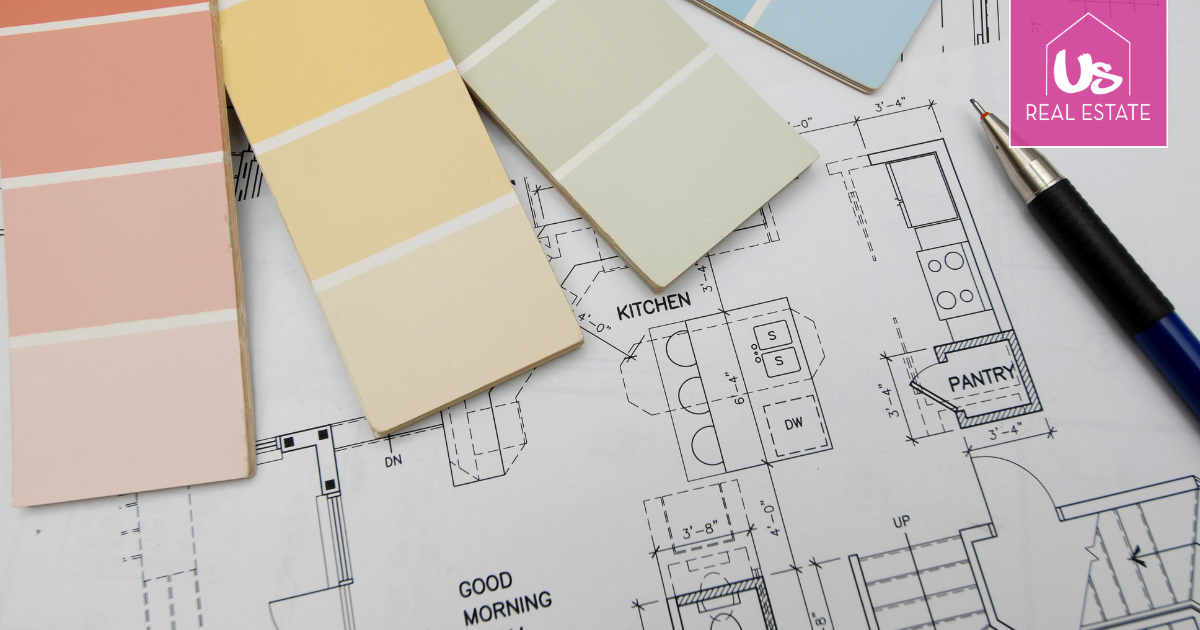
What Paint Colours Add Value?
While it’s hard to put a number on how much colour impacts price, studies have shown that homes with light, neutral interiors tend to sell faster and often above expectations.
A small investment in paint can have a big return—especially if your current colours are dark, dated, or personalised.
If you're repainting before selling, consider the following proven choices:
| Room | Recommended Colour Tones |
|---|---|
| Living Areas | Soft white, warm grey, beige |
| Bedrooms | Pale taupe, greige, muted blush |
| Kitchen | White, light grey, sage |
| Bathroom | Crisp white, soft blue-grey |
| Exterior | Charcoal, warm white, muted green |
| Front Door | Navy, black, burgundy (for contrast) |
Colour in Styling and Décor
It’s not just about paint. Your furniture, cushions, rugs, and artwork all contribute to the visual tone of your home. When selling, aim for:
-
Muted, complementary colours
-
Limited use of bold patterns or clashing tones
-
Textured accents in timber, linen, or metallic
A neutral base with small pops of colour—like a navy throw or a green plant—adds life without overwhelming the space.
Final Thought: Colour Creates Connection
The right colour scheme doesn’t just make your home look good—it makes buyers feel something. It creates calm, comfort, and possibility. It allows them to imagine their future in your space. And when that emotional connection happens, strong offers often follow.
So before listing your home, take a walk-through with a buyer’s eyes. Is the colour palette modern? Neutral? Welcoming? If not, a fresh coat of paint in the right tones could be the smartest, simplest investment you make before selling.
Need help preparing your home for sale? We can guide you on colour, presentation, and pricing to ensure a standout result.
Call now to see how much we can achieve for your property in today’s market.
John Lewis – 0423 487 266 | [email protected]
Karen Day – 0490 242 303 | [email protected]